All Case Studies

Workplace · UX Restructure · IoT

Comfy: Workplace
Experience App

Restructuring the UX of a fast-growing workplace app — from a feature-crammed bottom nav to a modular, scalable home experience.

My Role

Lead UX/UI — Research, Wireframing,
Prototyping, Dev Specs, Visual Design

Team

Front End Engineer, Product Manager,
Junior Product Designer, VP of UX

Focus

Navigation Architecture · Card Systems
Hybrid App Design · Design Systems

A workplace app that outgrew its own structure

Comfy's original mission was to solve the number one complaint in offices: temperature. Over a few years, the feature set rapidly expanded to include lighting, work requests, room booking, and desk booking. The floor map — part of the original app — grew in complexity as well.

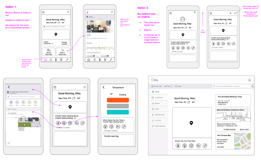
As a fast-growing startup working to be nimble, the design and dev teams opted to add new features as individual pages in a bottom nav. The user landed on the floor map when opening the app.

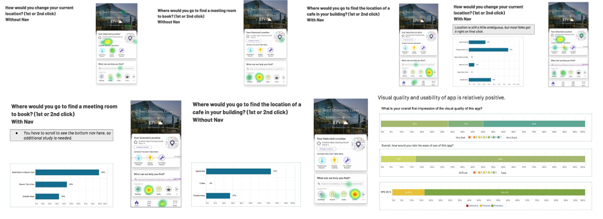
This structure had reached a breaking point — more features had no place to go, users were confused on launch, and enterprise customers needed a premium first impression.

Users reported landing on the floor map was daunting — the call to action was not obvious.

As more features were added, the bottom nav had no room to grow. The team had reached "peak-nav."

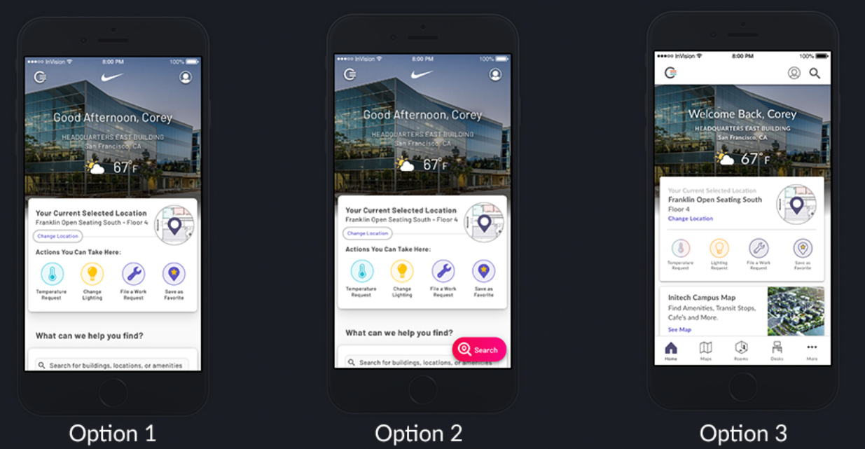
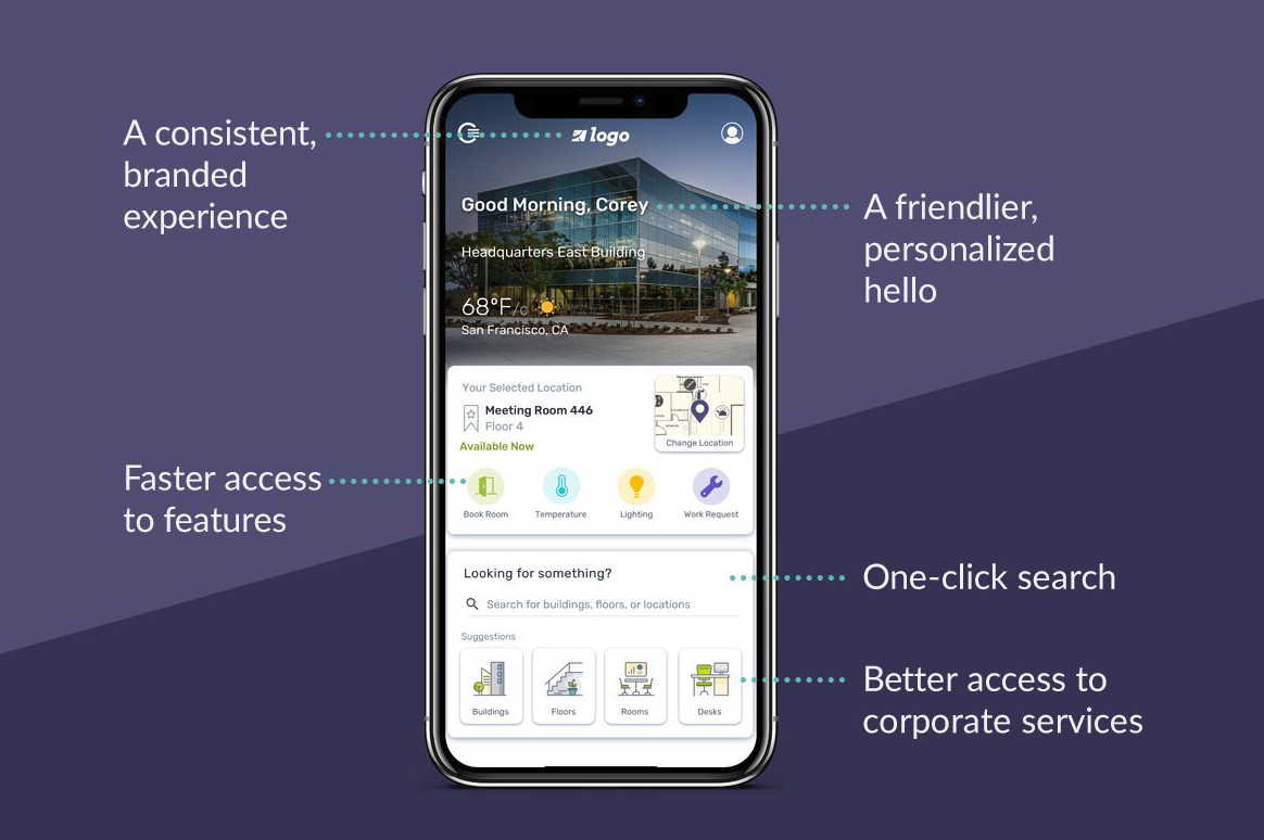
A dedicated home page was needed — both for usability and as a request from enterprise customers.

Goals for success

Welcome and orient users on launch — give them a complete picture of their workplace in a single view.

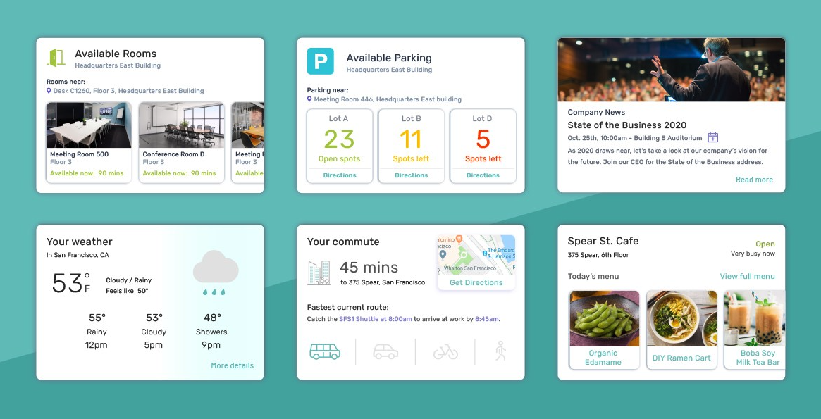
Introduce a modular card system that allows new features and micro-services to be customized and released quickly.

Make a high-impact first impression for enterprise customers with the premium feel of a workplace experience app.

Research, wire, prototype — with an unexpected tool

Comfy is a hybrid app built in Cordova — a single codebase for mobile and web, available on both App and Play Stores. This hybrid model posed real challenges around breakpoint optimization and the back button behavior differences between Android and iOS. These constraints shaped every design decision.

The hybrid model is great for a small development team, but creates tricky edge cases around breakpoint optimization and the back button navigation of Android vs. iOS — both played a major role throughout the project.

Phase 1 Research

Divergent exploration + user interviews

Compiled divergent design ideas to solve "peak nav," complemented with user interviews using click-through InVision prototypes. Surfaced key technical and scoping questions for the dev team.

Wireframing

Google Slides as a design tool

The team used Google Slides to pair on wireframes — an unconventional choice that enabled rapid feedback loops. The design team presented options to the dev team for technical feasibility review.

Prototyping

Three options for testing

Built three testable prototypes: (1) No Nav with a Search card, (2) Floating Action Button for Search, (3) Bottom Nav with Search in Header. Option 2 was quickly ruled out — only 3 of 10 users tapped the FAB.

User Testing

UserZoom click test + heat maps

A basic click test validated that users could complete all tasks with either nav structure. Heat maps confirmed no-nav was viable — and the executive team preferred it to elevate the product's style.

Google Slides wireframes showing nav options for Comfy app User testing heat maps and click data comparing nav structures Three prototype options shown on iPhone mockups

Removing the nav — and the complexity with it

After synthesizing research and getting sign-off from PMs and the dev team, the focus shifted to preparing for handoff. This meant developing matrices for every permutation of feature sets a customer could have, crafting a detailed dev spec in Jira Confluence, and drafting high-level stories with the lead developer and PM.

No-nav won. Heat map data and executive preference aligned — removing the bottom nav de-cluttered the experience and elevated the premium feel without hurting task completion.

Modular card system. A card-based home screen replaced the floor map as the landing experience — giving users an at-a-glance view of their workplace and a flexible surface for future feature additions.

Hybrid constraints drove scope. The Android/iOS back button behavior and breakpoint edge cases — especially "phablet" sizes — required careful scoping and phased development planning.

Style guide updated in parallel. Visual design refinements were compiled in InVision's DSM tool, synced with Sketch, to keep assets current as development progressed.

A foundation for endless customization

The new enhanced welcome experience sets the stage for a full roadmap of enhancements — including card customization, enhanced amenity information, and step-by-step navigation. It gives users the tools to be productive and engaged at work, and customers the ability to satisfy the individual needs of their building environments.

Peak-nav solved

The modular card home screen replaced the bottom nav, giving the app room to grow with future features.

Enterprise-ready

A premium first impression for enterprise customers — elevated enough to anchor sales pitches and onboarding.

Updated design system

Visual design refinements shipped in parallel with development, establishing a refreshed style guide for the product.

Comfy modular card system showing rooms, parking, weather and commute cards Comfy app final design on iPhone showing key features

Next Case Study

Counter Culture Coffee