All Case Studies

B2C · Pricing · IoT · SaaS

Mapped

Pricing for B2C SaaS is complex — the user experience shouldn't be. Designing a self-serve onboarding flow for a building intelligence platform.

My Role

UX Research, UX & Marketing Design,
Copywriting

Team

Executive Team, Architecture Advisor,
Lead Developer, Director of Marketing

Focus

Pricing UX · Self-Serve Onboarding
Marketing Design · Two Design Systems

An OS for the built environment — sold simply

Mapped is a startup in the building technologies and IoT sector. Their platform provides an "independent data layer" for commercial and industrial spaces, helping property owners, facility operators, and solution providers access real-time data from building systems — temperature, motion sensors, lighting, and more — through a digital twin. The main users are software developers.

The company was successfully selling to enterprise customers, but needed a self-serve path to let individual developers and small teams access the platform quickly, without a sales conversation. That meant tackling two layers of complexity at once.

SaaS pricing structures are inherently complex. Terminology and data structures for commercial building systems are also highly complex. The challenge was solving both simultaneously and delivering a transparent, frictionless flow into payment and data setup.

The pricing model had several moving parts to wrangle:

Pricing based on number of buildings deployed, plus a variable API usage fee based on data consumed.

A gateway connection fee — either virtual (VPN, free) or physical hardware — that most self-serve developers would never need.

Contract term length as an additional pricing variable, ultimately cut to reduce friction.
Research, structure, then simplify relentlessly

Working directly with the Executive team, I gathered best practices and competitive examples, then presented a research exploration on how to frame the pricing model. We landed on three tiers — Starter, Basic, and Pro — and from there I had to align the pricing criteria to both the marketing page and the in-app welcome experience simultaneously.

Tier 1

Starter

Free forever model with thoughtfully placed upgrade prompts that didn't interfere with developer workflows.

Tier 3

Pro

Scaled access for larger teams with higher API usage needs and more building deployments.

Marketing Page

Slider-first pricing

A building-count slider became the centerpiece of the pricing page — interactive, estimable, and immediately useful. "Sticky stops" were added post-launch to reinforce expected slider behavior.

Progressive Disclosure

Hiding the complexity

API fee details became an FAQ. FAQs were tucked into accordions. The full feature list moved to a secondary page. Gateway costs were separated from the main flow entirely.

In-App Flow

Mirroring the marketing site

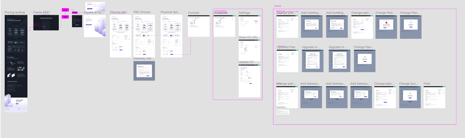
Worked closely with the VP, CTO, and Lead Developer to design the payment and data setup flow in parallel with the marketing page — two flows, one cohesive experience. View in Figma →

Upgrade Prompts

Effective without annoying

The free tier included strategically placed prompts to encourage upgrades — designed to serve the business goal without disrupting developer flow. View in Figma →

Mapped pricing and self-serve flows in Figma

Simplicity is the hardest thing to ship

Every decision on this project was a negotiation between business transparency and user clarity. The default instinct from the team was to show everything — every fee, every variable, every edge case. My role was to advocate for progressive disclosure at every turn.

The slider as anchor. Everyone aligned on a building-count slider as the primary interaction. Making it prominent and interactive gave users a sense of control over their cost estimate before committing.

Gateway costs separated. Most self-serve developers would only ever use the free virtual option — showing hardware pricing upfront would have added confusion without value. This was eventually moved out of the main flow.

Term length dropped entirely. Initially part of the pricing model, contract term length was cut from the initial design that shipped — a meaningful simplification that reduced the decision load at a critical conversion moment.

Early launch with contact forms. The pricing page launched before payment was fully ready — tiers led to contact forms, allowing sales to capture leads and message at the full launch.

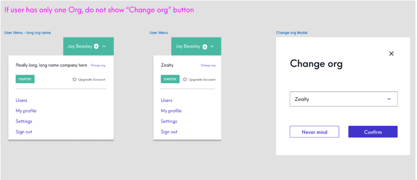
Org switcher as an edge case catch. Rapid iteration surfaced the multi-org use case late — users belonging to both a business and personal account had no way to switch. This was caught and resolved before launch. View in Figma →

Org switcher UI design showing user menu and change org modal

Self-serve, shipped — and a lesson in edge cases

Over three months, the team delivered a smooth self-serve experience allowing developers to log in, pay, and get data uploaded to begin mapping — all in one flow. The final result is live.

Self-serve achieved

Single developers and small teams can now access the platform end-to-end without a sales conversation.

Two design systems bridged

Successfully unified the marketing site and platform design systems into a cohesive experience across both touchpoints.

Small wins shipped early

Pricing page launched ahead of full payment readiness — using contact forms to capture leads and build pipeline during the gap.

Reflection: if I could change one thing, it would be to deeply pressure-test edge cases before design and development began — the org switcher and connector issues could have been caught much earlier with more structured discovery upfront.

Next Case Study

Comfy